2. Editorial DesignThe Australian Women’s Weekly
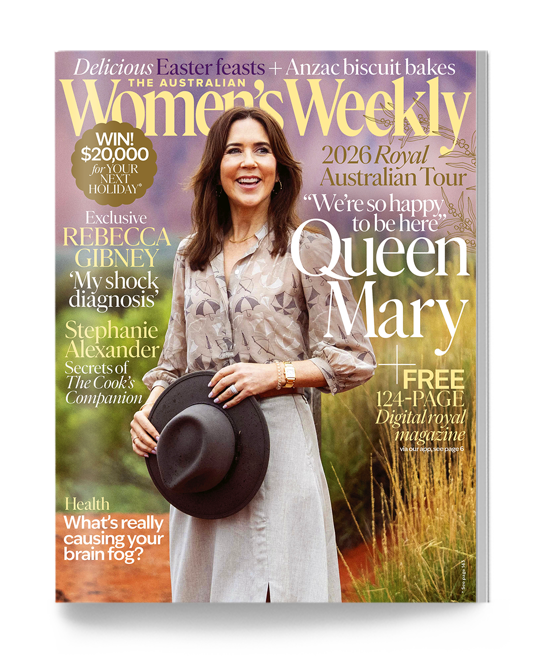
The Australian Women's Weekly is Australia's oldest and highest-selling women's lifestyle publication, telling authentic, distinctive stories of Australian women, life and culture for more than 93 years.
I joined the team at a pivotal moment of change, tasked with refreshing the brand and rebuilding its credibility as a trusted, authentic voice, ready to evolve for a shifting cultural and platform landscape.
Process
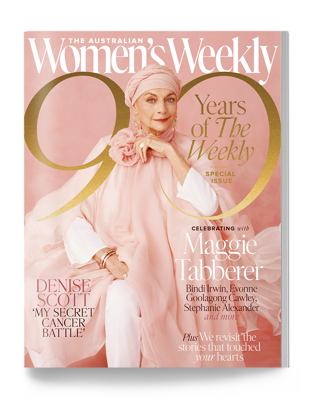
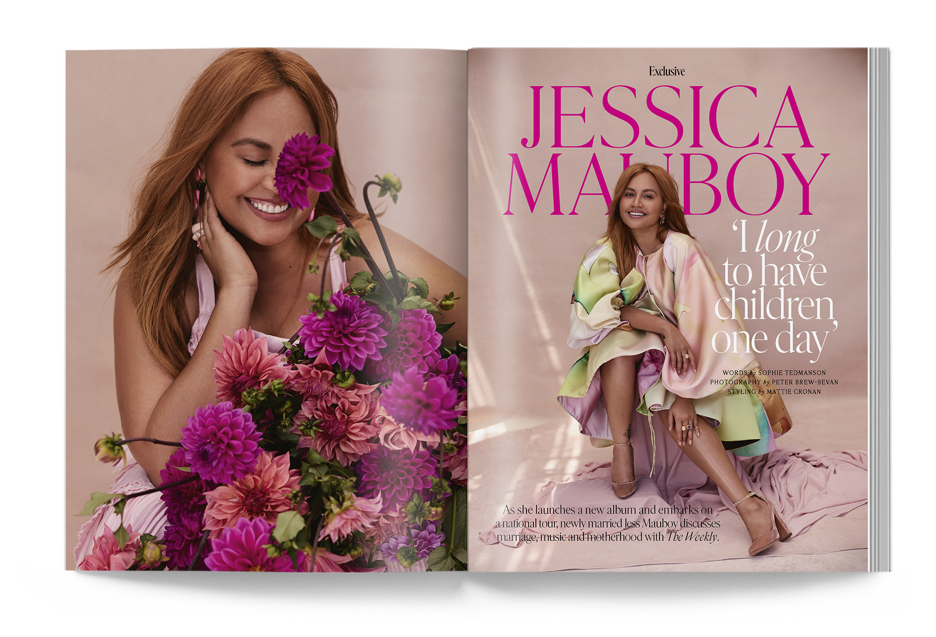
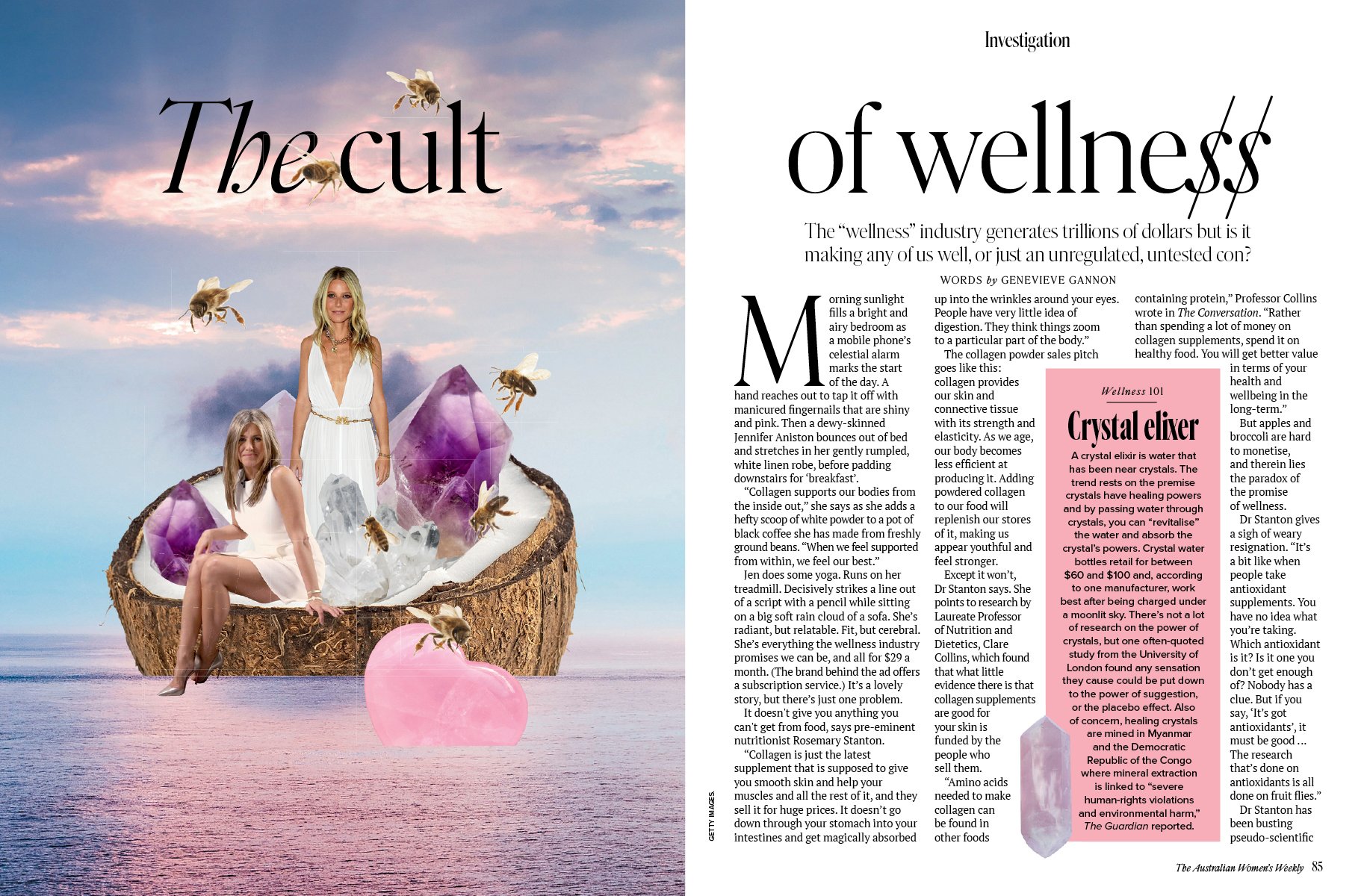
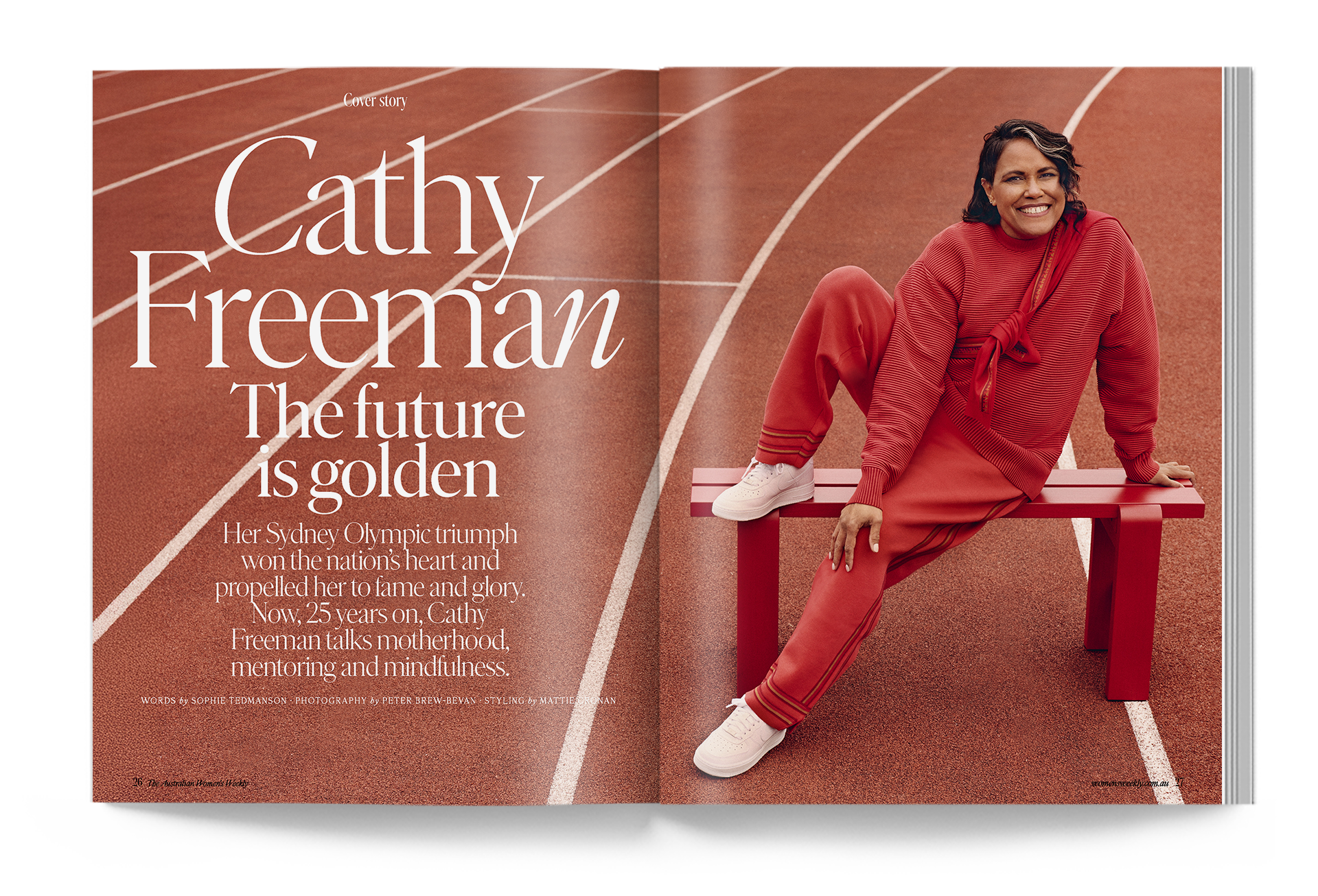
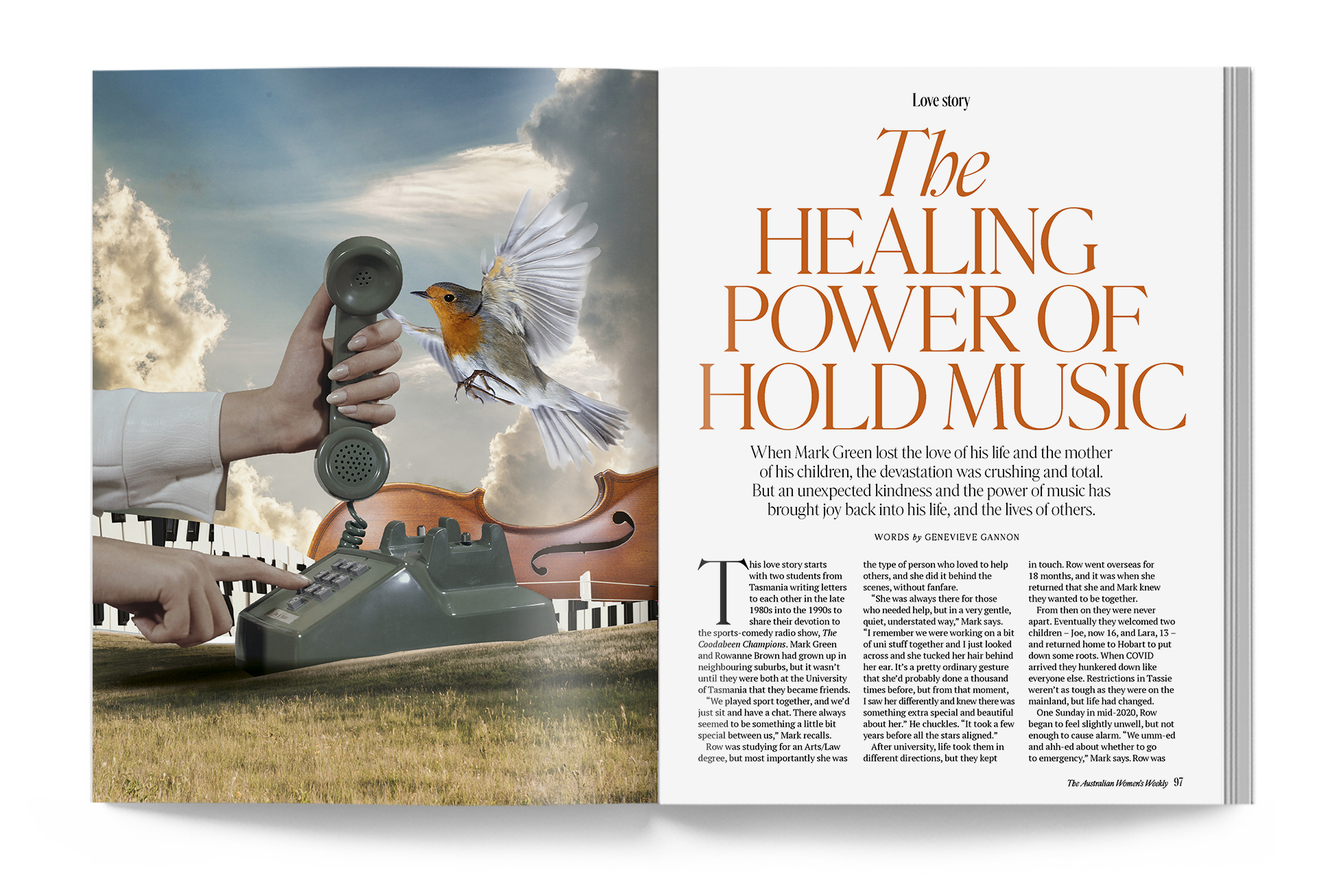
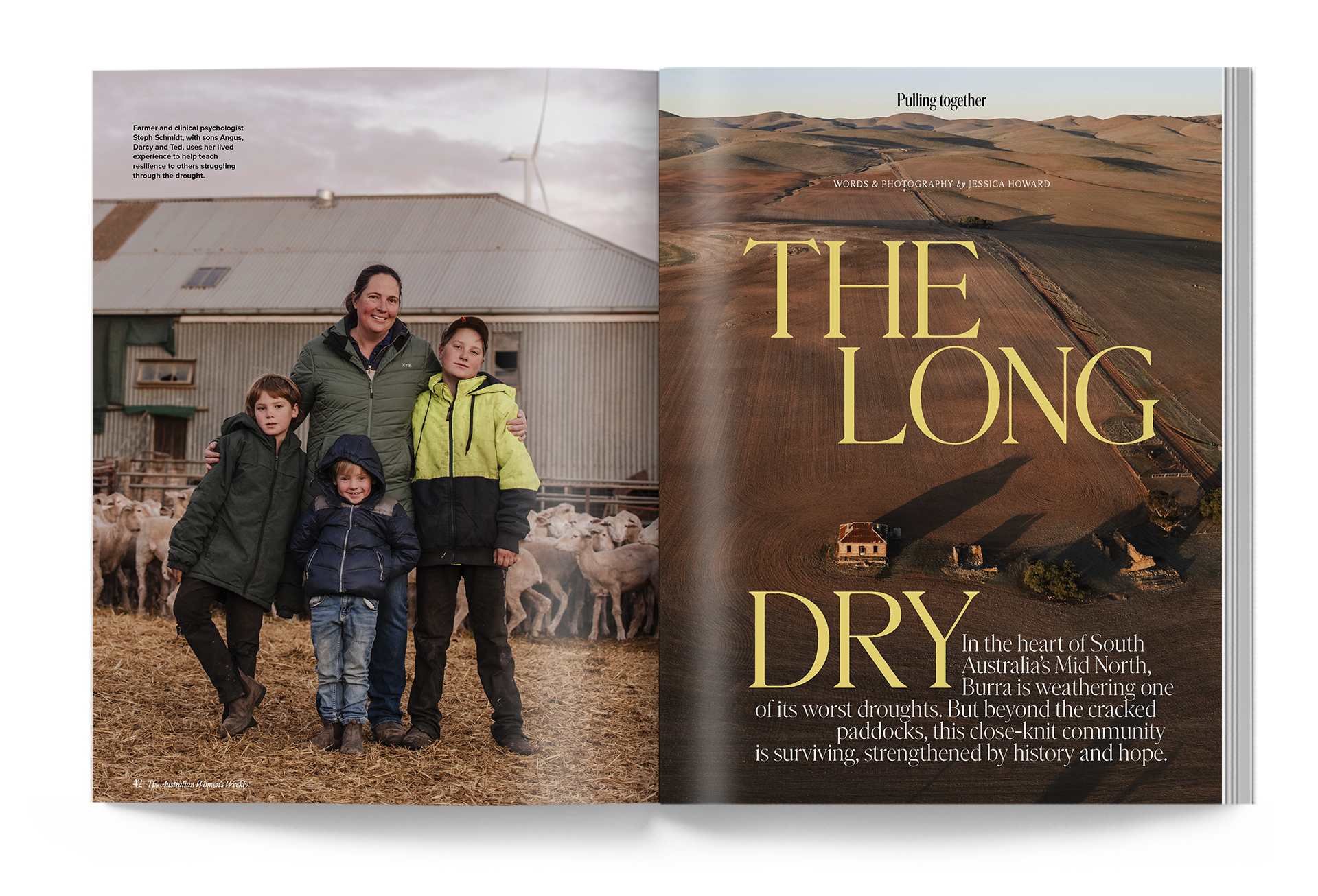
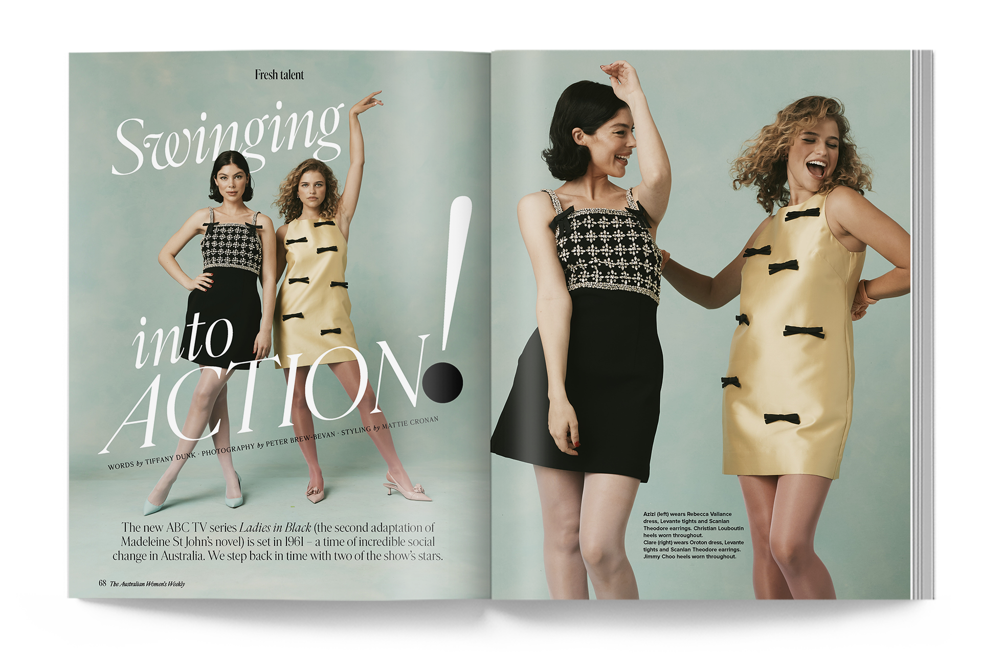
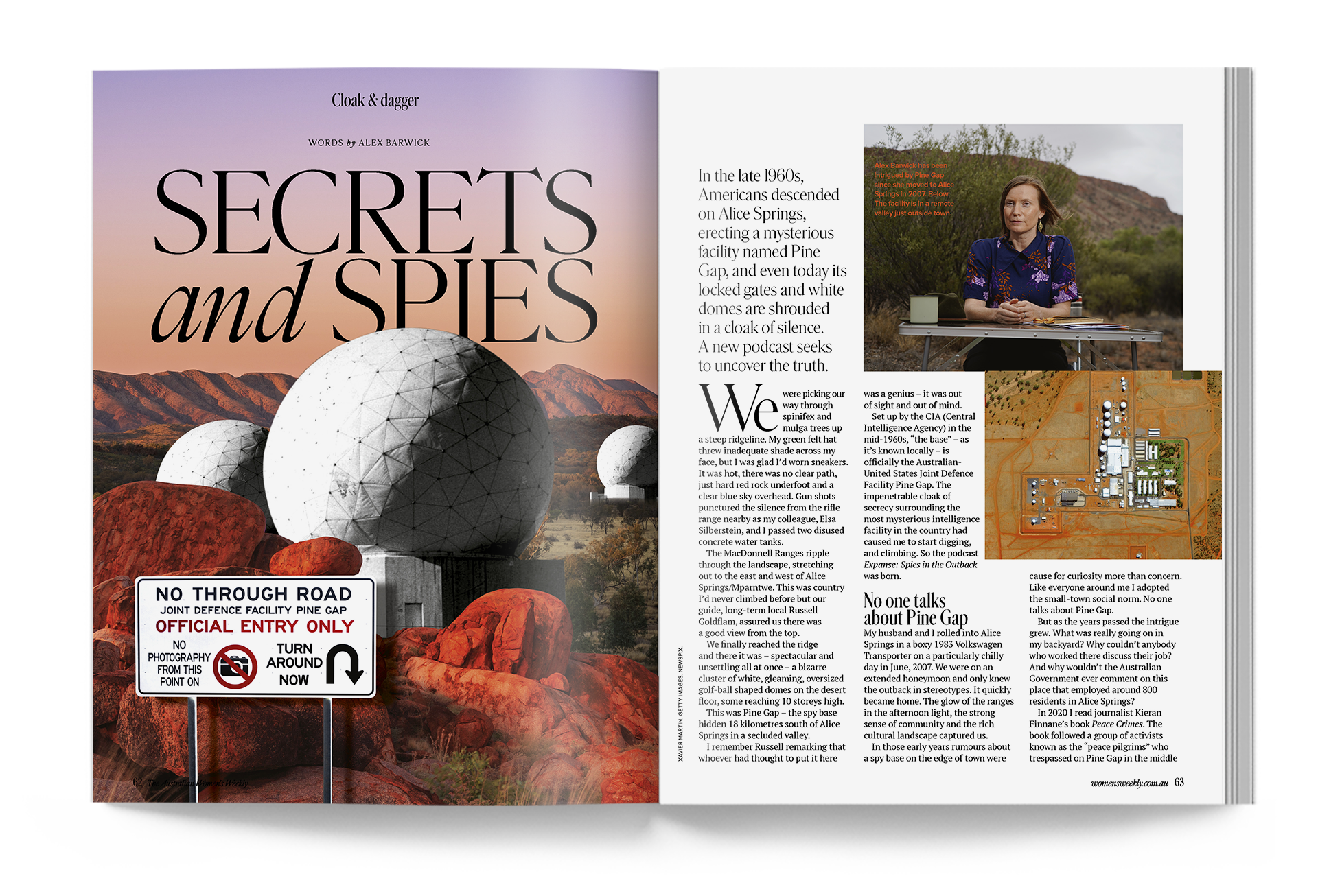
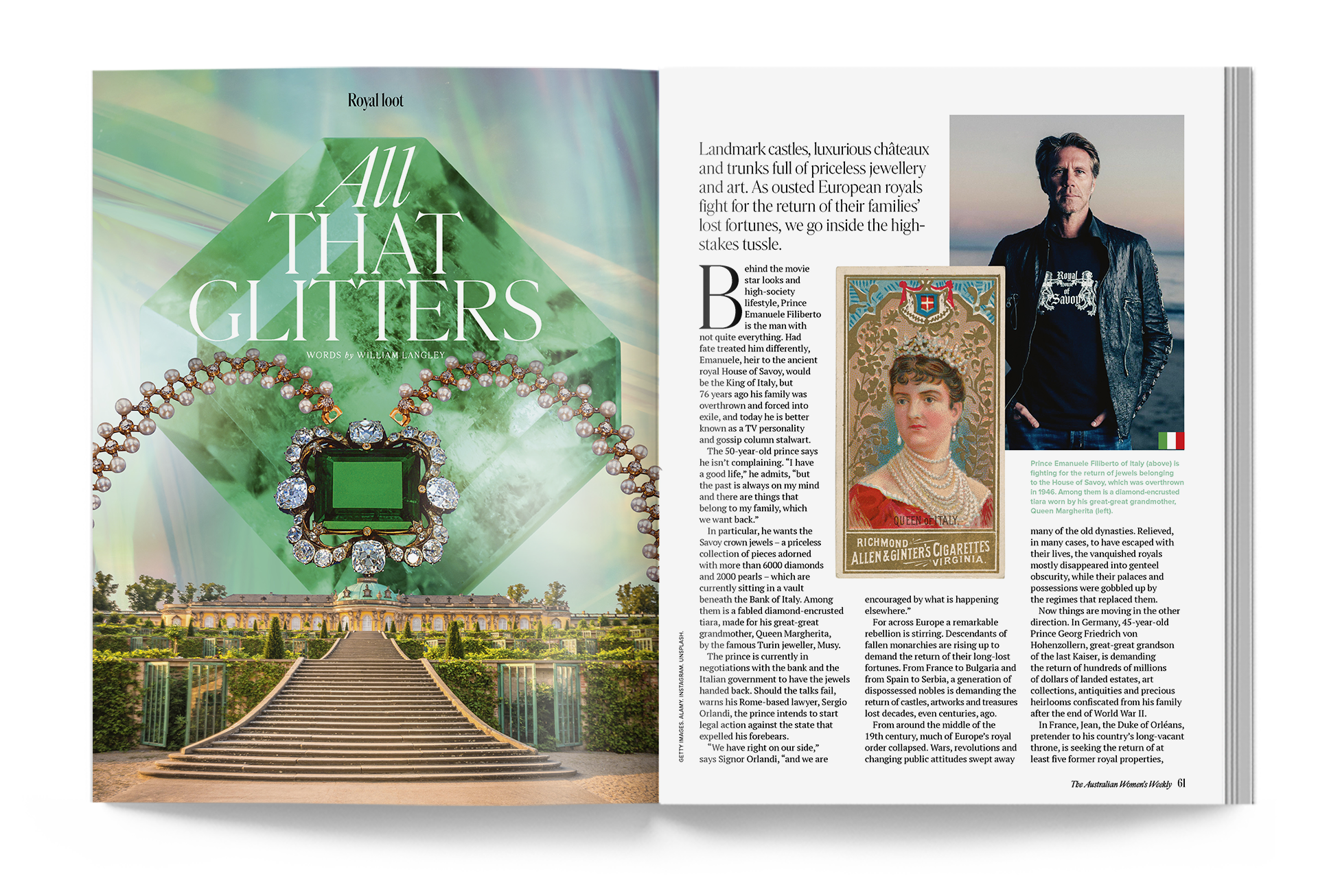
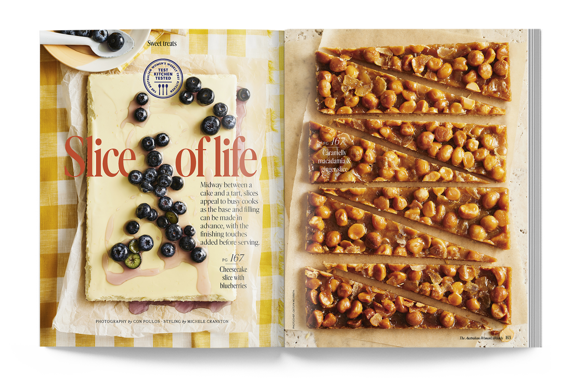
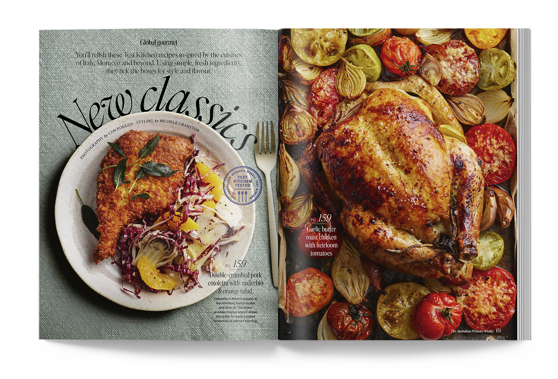
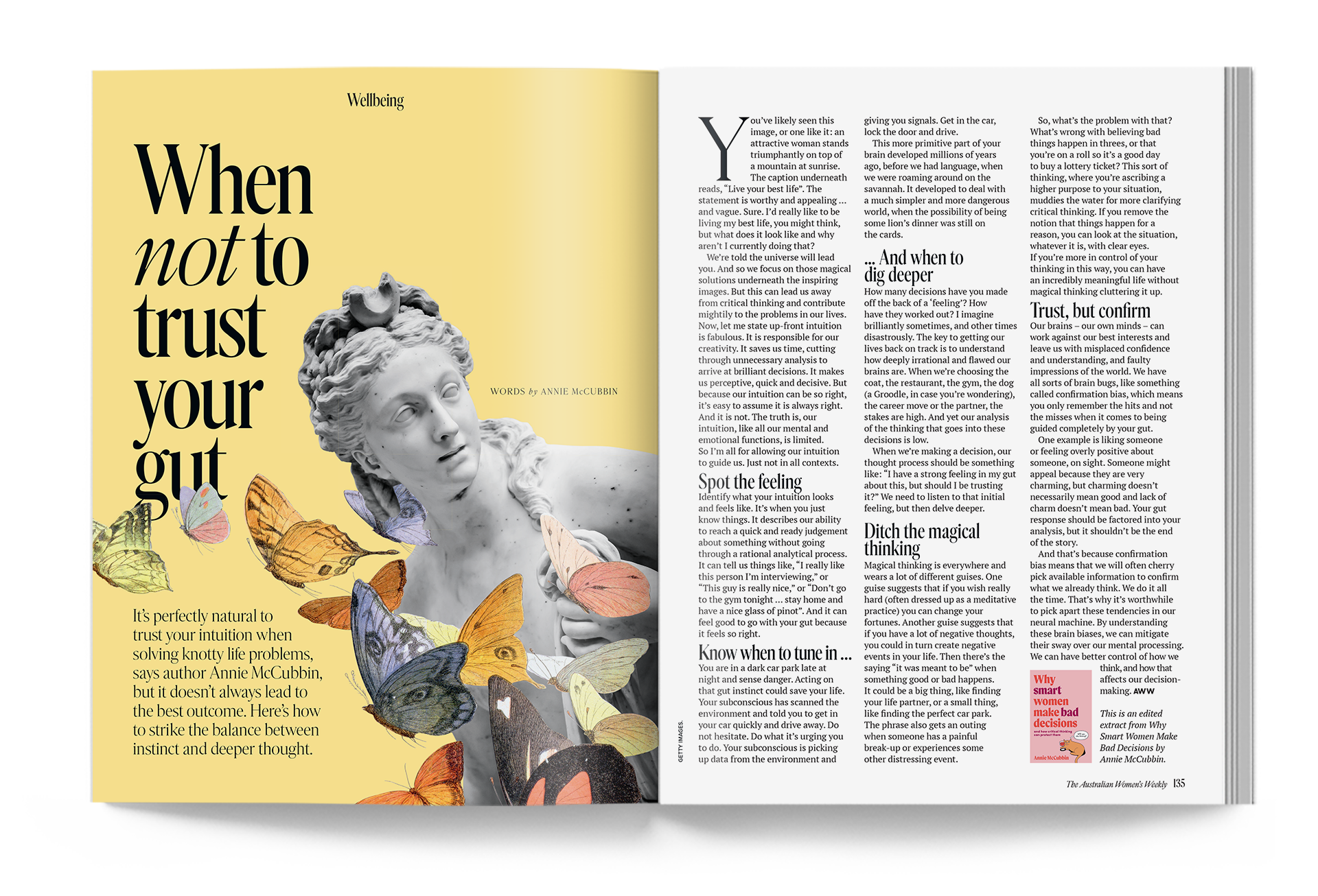
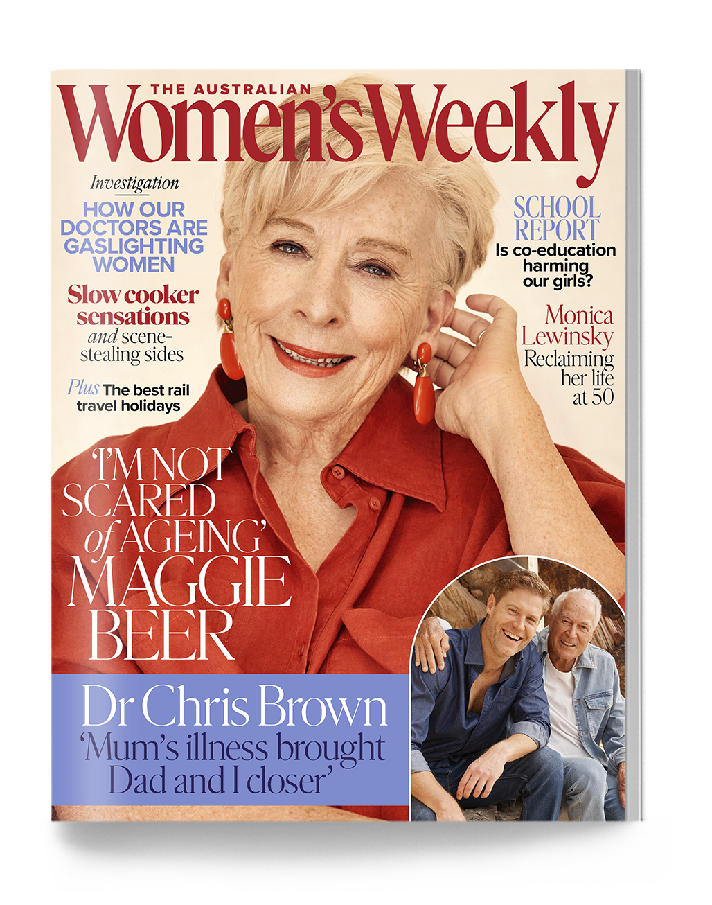
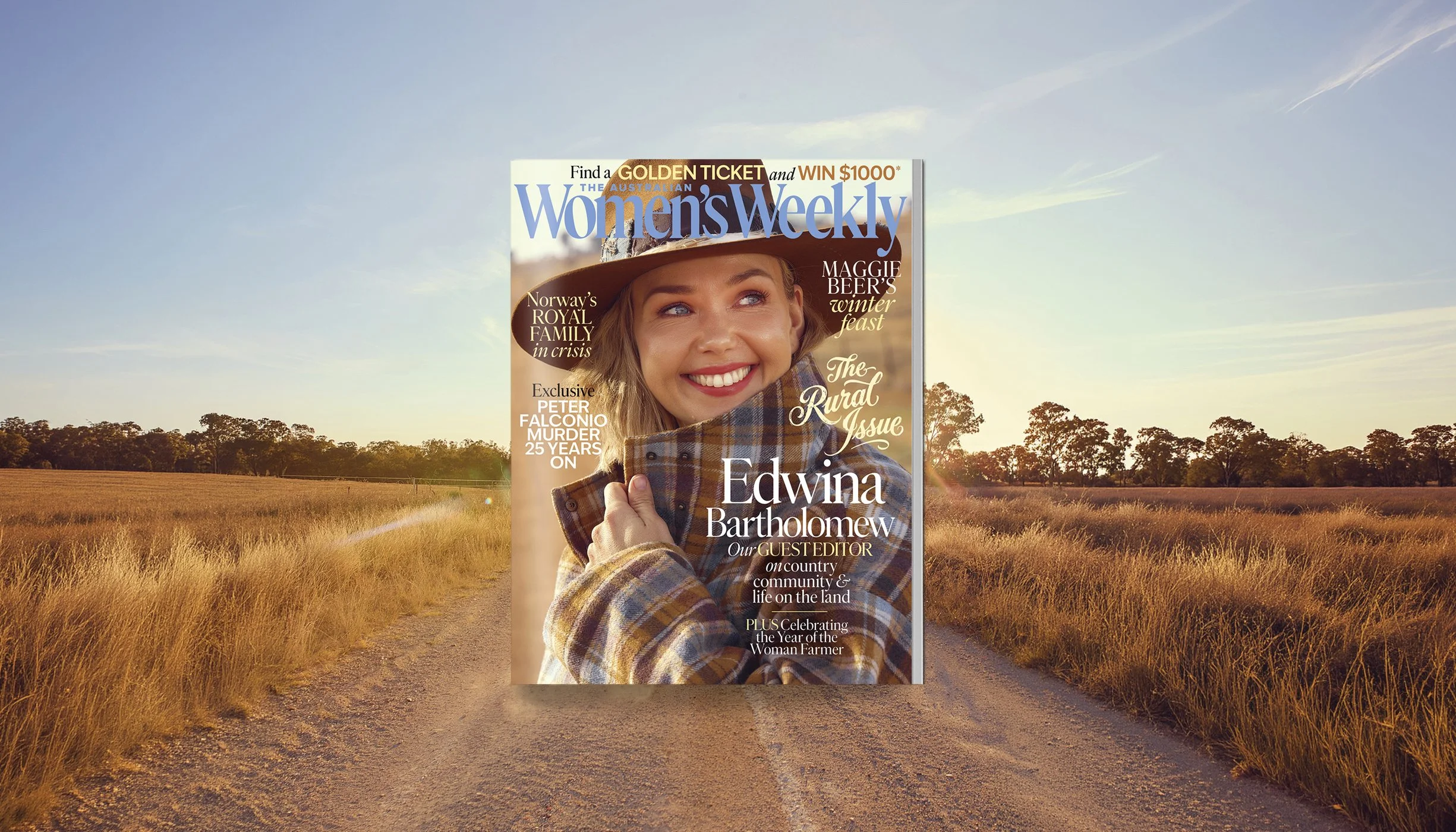
My approach to magazine craft has always been consistent: finding the right balance and rhythm across the book through a brand DNA woven into typography, design and image selection. For a lifestyle title as broad as The Weekly, this DNA is essential, tying together everything from celebrity and true crime to cultural commentary and heartbreaking real-life stories, alongside health, beauty, fashion, food and travel content. That DNA is built on clarity and readability: typography with a friendly tone and an atmosphere of trust — we rarely use all caps, and use italics within headlines and copy to reinforce our conversational voice.
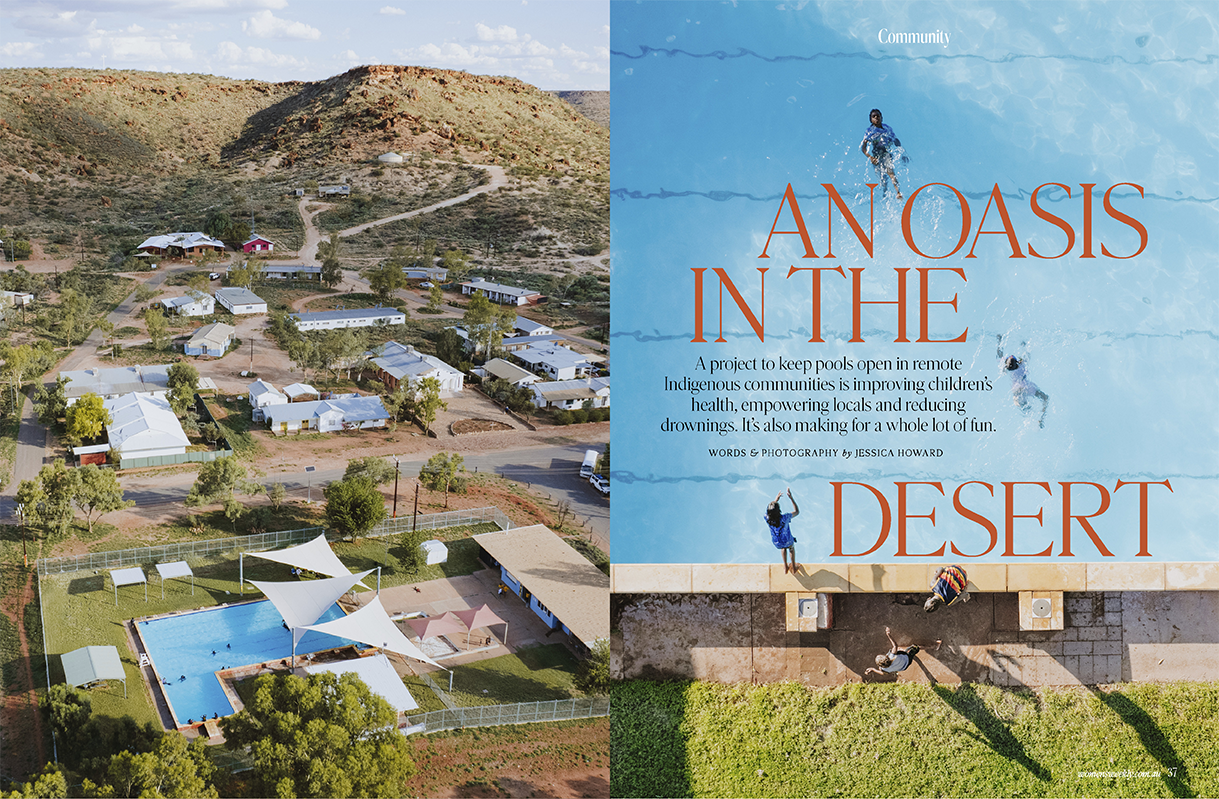
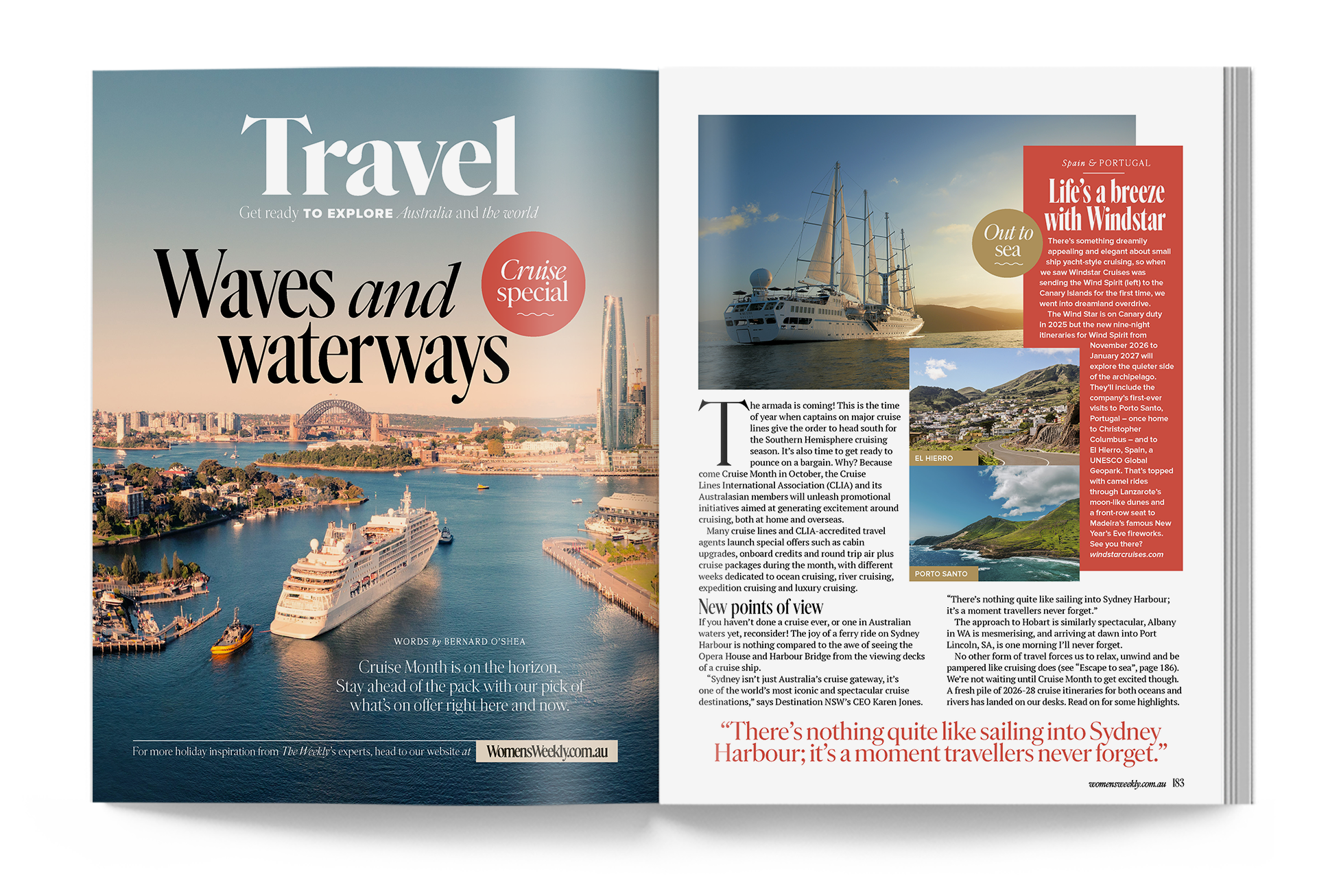
Simplicity of layout structure and ease of comprehension are just as important. With a broad audience, we pair easy-to-read running copy with energetic pages that offer multiple entry points, giving readers both quick reads and moments to linger.
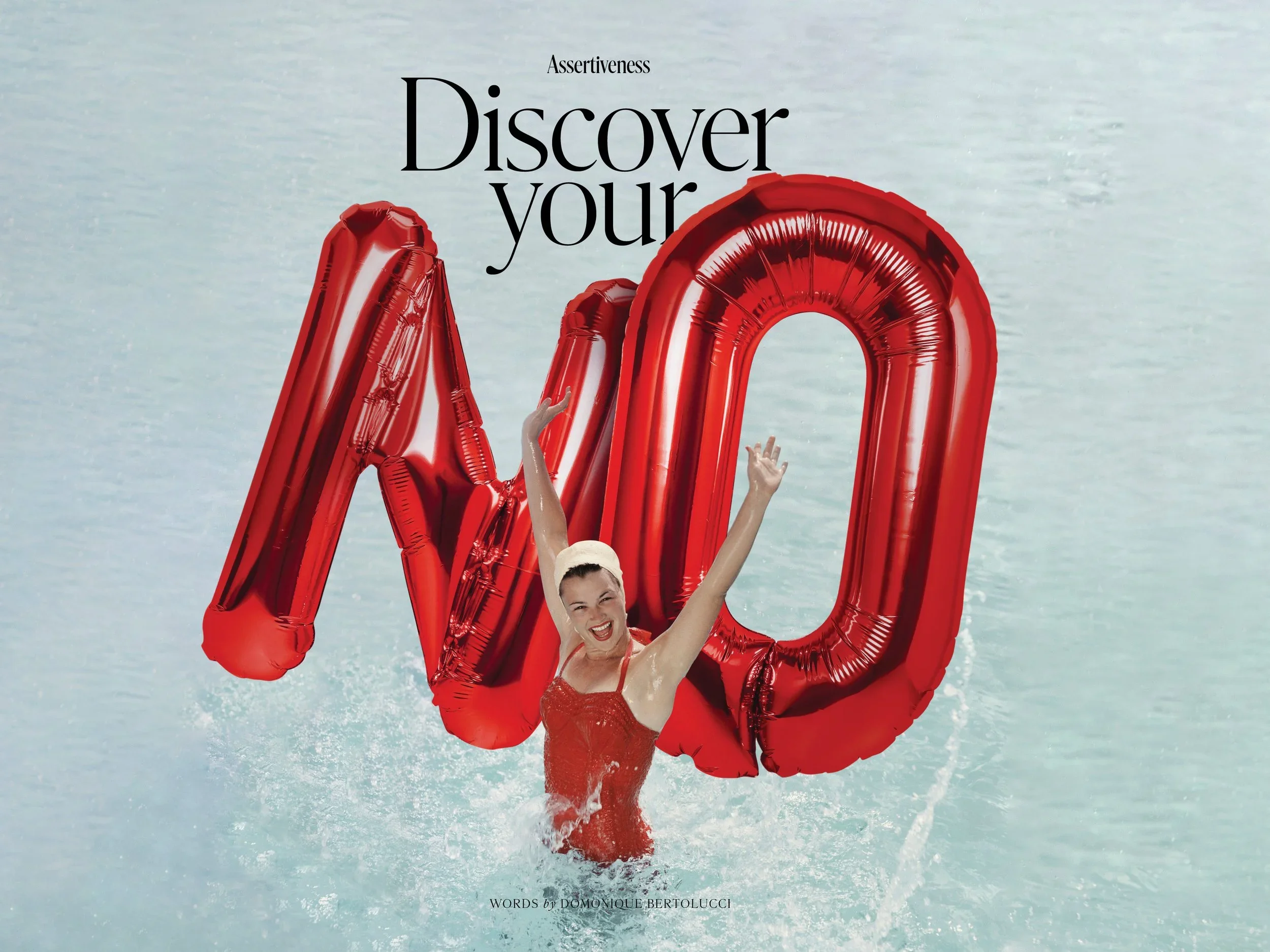
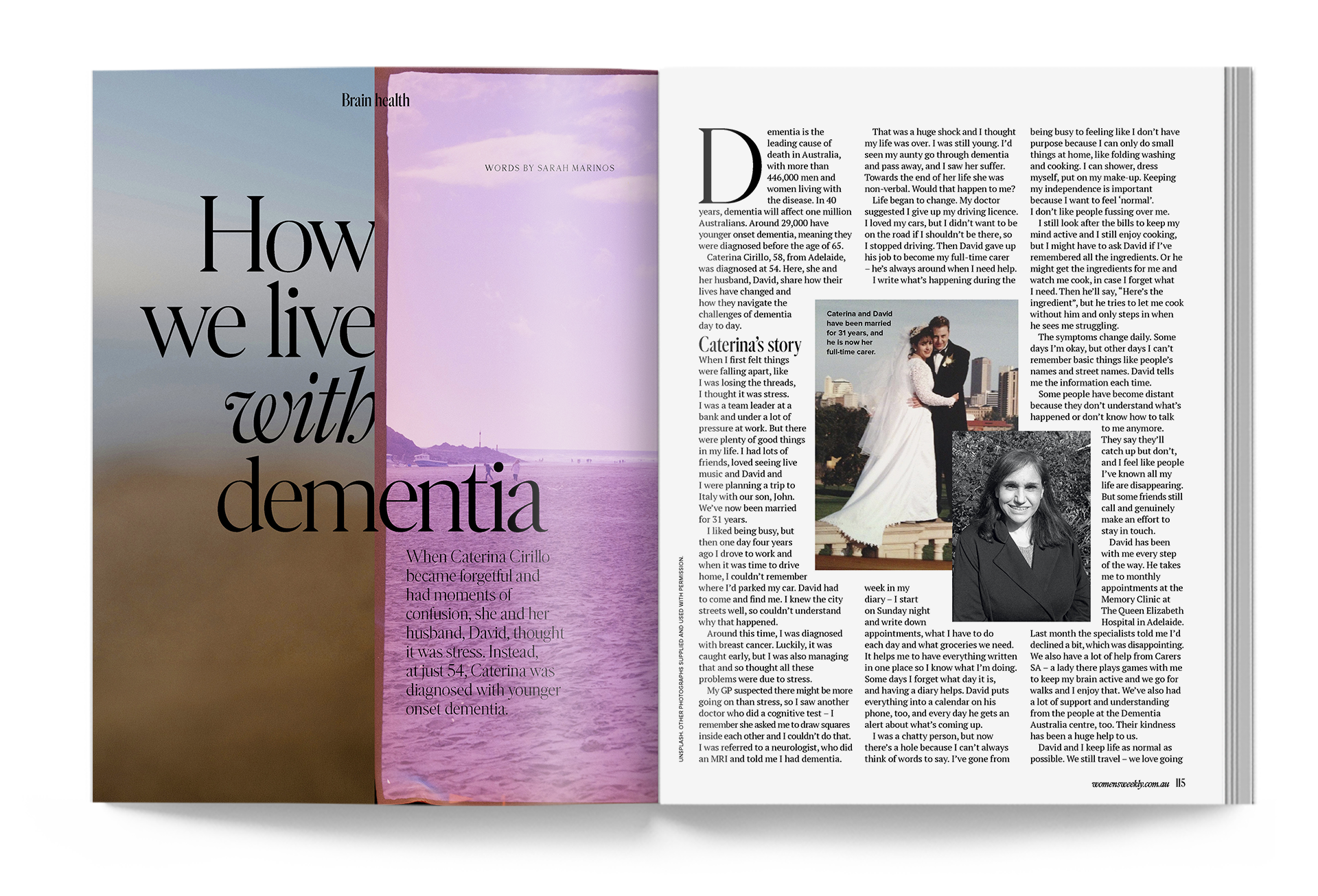
I believe in creating “worlds within a world”, ensuring each feature story is an engaging entry point for the reader, and choosing the right visual solution to achieve that: whether a single bold photograph, an authentic collection of images unfolding a real-life story, or an intricate collage that draws readers into the narrative.
The Weekly is a big publication, and with that comes real challenges around time, budget and a broad team, all of which can affect consistency and flow across such a large magazine.
Two of the key tools I established as Creative Director to guide our team through a united approach are:
Visual Guide to Feature Stories (view)
A visual reference for the types of features we commission, helping editorial teams visualise the right mix at the issue-planning stage. It also captures estimated budgets for each story type, supporting the planning process.
The Image Guide (view)
I like to imagine The Weekly existing on a sunny afternoon, cup of tea in hand: a warm, cosy, comfortable place to explore and relax. To bring that feeling to life, I created a glossary of AWW-appropriate imagery, a guide for how we approach stock and content photography across every content pillar. This has been especially valuable as our digital teams have scaled, ensuring everyone makes visual decisions with the same intent.
Results
Over eight years, this has remained an evolving process, continually learning what content resonates and adapting alongside our audience. The measure of success is a brand design that has translated seamlessly across multiple platforms, two websites, social platforms, video and television, while the print edition remains Australia's highest-selling women's lifestyle magazine.
This work was previously recognised with a Highly Commended for Designer of the Year at the Mumbrella Publish Awards, and in 2026 the title was nominated for Publication of the Year.